Internal Management Tool
Designing a pro-bono pet care management system for the Oakville & Milton Humane Society from 0-100.
Role
Product Designer
Team
3 Product Designers
2 Product Managers
9 Developers
Duration
May 2024 - April 2025
Overview
As a product designer at UW Blueprint, I was provided the unique opportunity to design a pro-bono management platform for the Oakville & Milton Humane Society, servicing over 235+ users.
We designed an all-in-one web app solution streamlining volunteer task management, pet care, and admin processes. Through 12 months, I led the design of the pet list, add a pet flow, and interaction log, as well as the creation of the design system.
Context & Problem
Currently…
The Oakville and Milton Humane Society (OMHS) is an independent nonprofit supported by donations, providing shelter and care for up to 300 animals.

The Oakville and Milton Humane Society needs a way for users to manage pet care, log activities, and track task completion.
Currently, admins have an inefficient manual system for managing pet care and volunteer tasks, relying on whiteboards and paper records. The animal behaviourist struggles to assign and track tasks, involving 19 active dog kennels, 30 cats, to over 70 volunteers.
જ⁀➴₊⊹
To Begin.
Discovering
Research
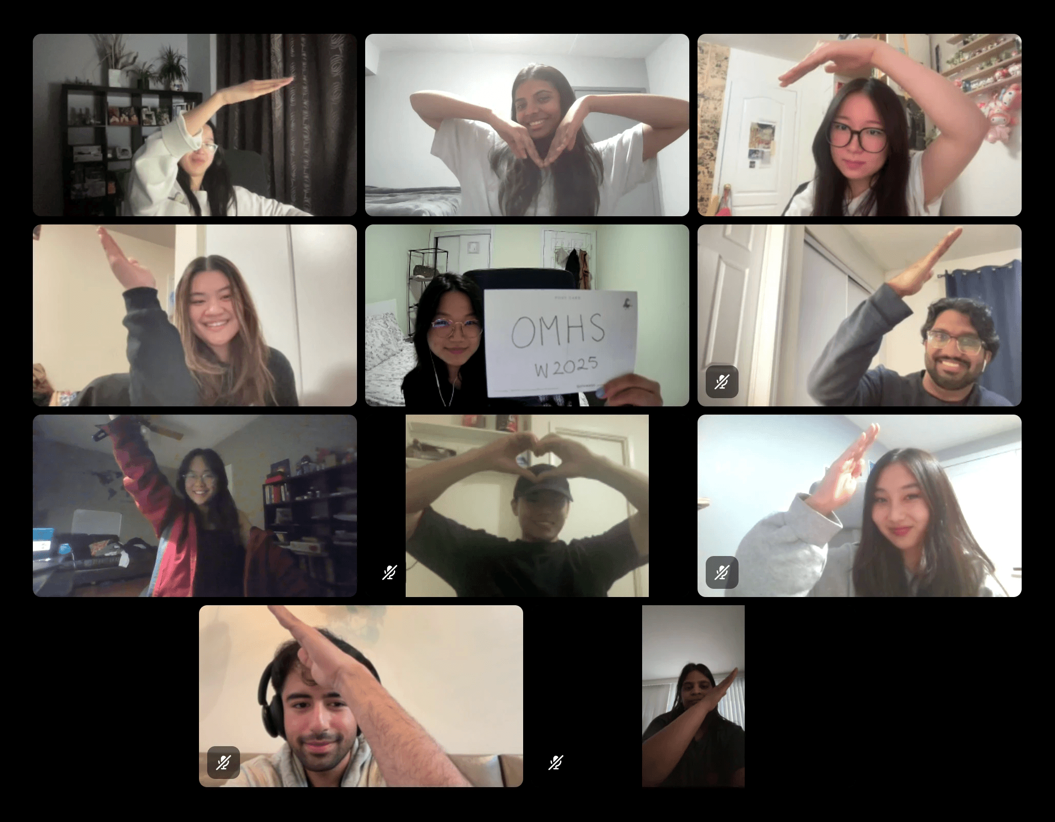
Client Meetings
To discover and investigate paint points, we met with the client!

Our talks helped us discover pain points which we grouped into 3 main categories: Volunteer Coordination, Task Communication and Animal & Activity Tracking.
Synthesizing Research
Identifying Features from Pain Points
To set the basis for the tool, we worked to derive pain points into corresponding features and flows.

This also had us considering our two user types (Volunteers and Admin) and which features would be accessible to either group.
User Flows
Mapping out User Flows
One of our earliest steps was flowing out every action a user could take. This is for a volunteer! (The admin one was even bigger!)

જ⁀➴₊⊹
Feature
Pet List
Low Fidelity
Exploration
I started with designing the Pet List page. This was early in the project, before we had a design system or defined visual direction. I began exploring ideas in low-fidelity to focus on feature layout and flow first.

Iteration
Iterating
The Pet List page went through the most iteration as we redefined scope, flows and design system through the first 4 months of work.

Final Design
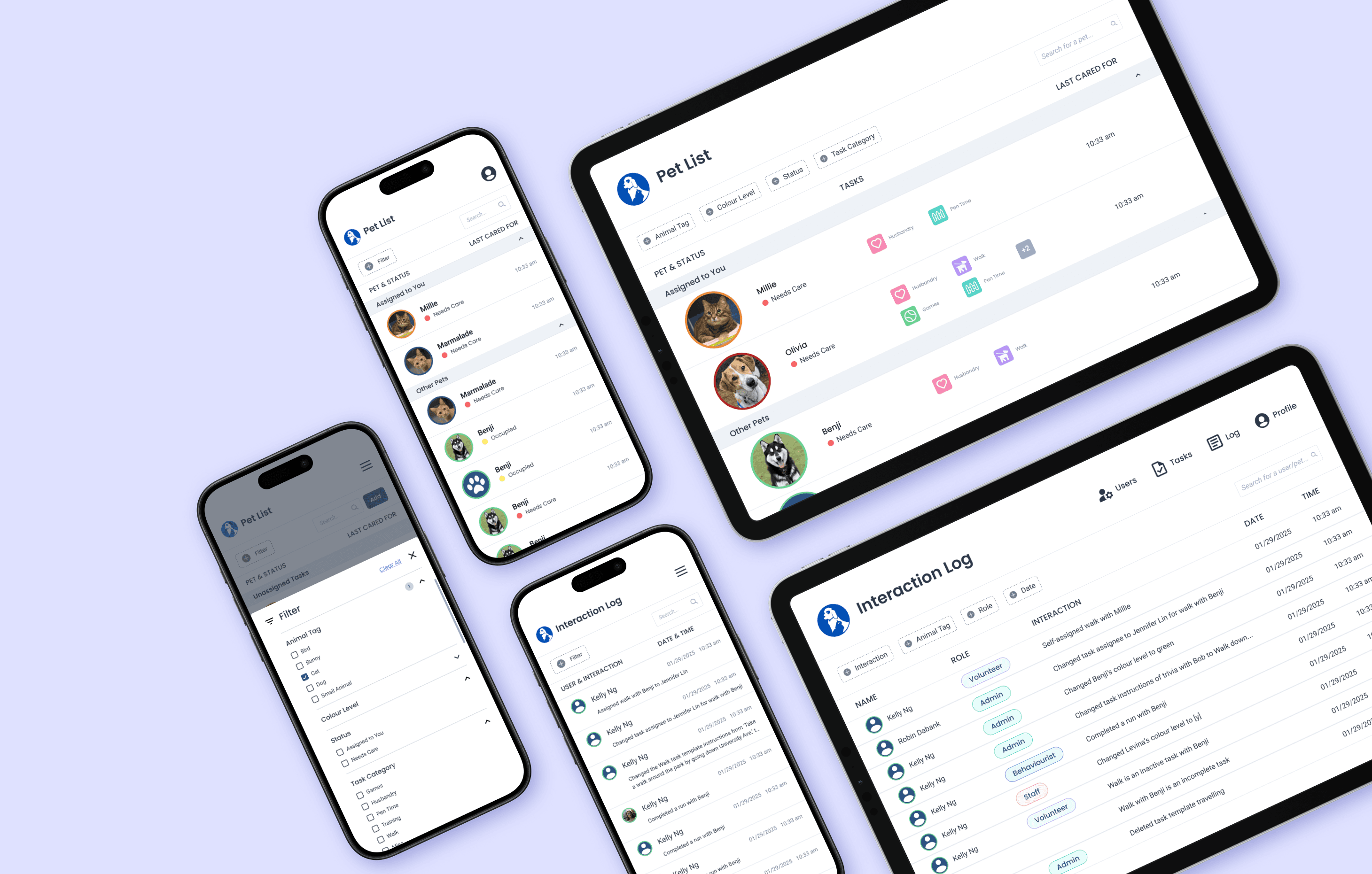
Pet List Final Designs
Finalizing the Pet List set the tone for the rest of the tool. It helped lock in consistent layout and interaction patterns moving forward.
જ⁀➴₊⊹
Feature
Interaction Log
Idea
Interaction Log
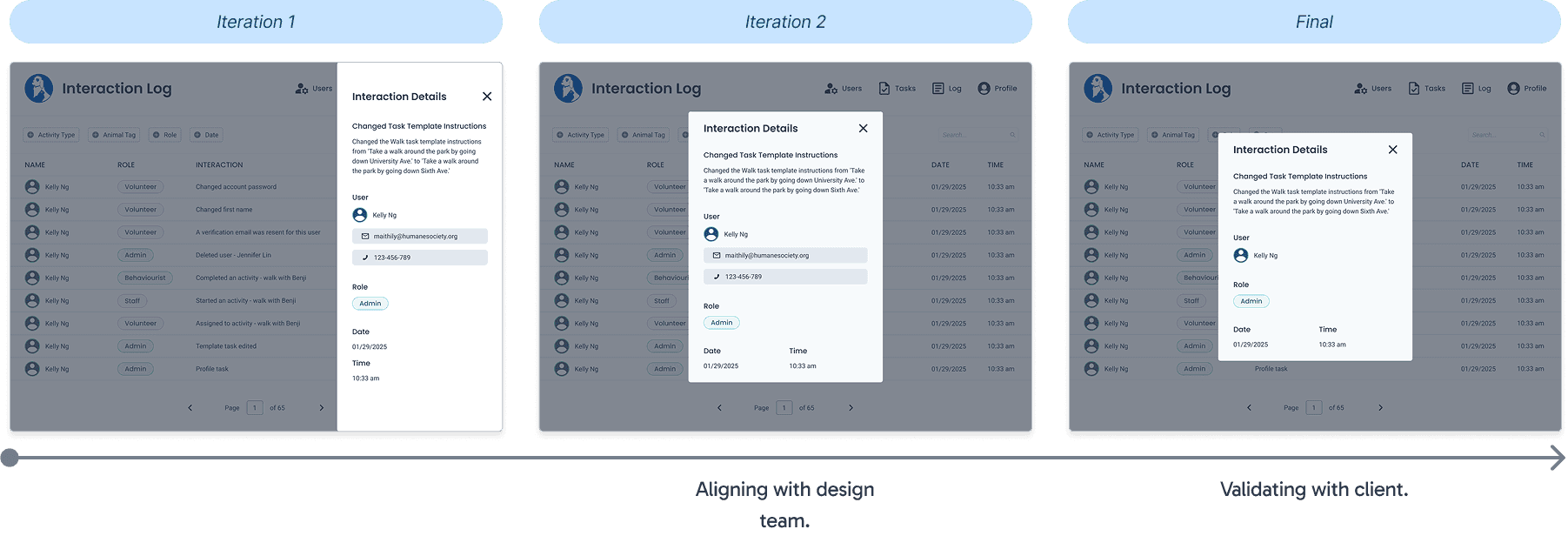
From initial discussions, the client want a way to see everything that happens in the tool as an Admin! The feature we derived was similar to an audit log or notifications page, where the Admin can track and view every user interaction.
Iterating
How does the user see all this information?
Inspired by apps like Instagram and Discord, I chose to lay out the interactions in a table.

What happens when the user clicks on an interaction?
Now what should a user see when they want to view the full details of an interaction? At first pass, I gravitated to the side tab, but aligning with the rest of the designs, I designed an Interaction Details pop-up!
Final Design
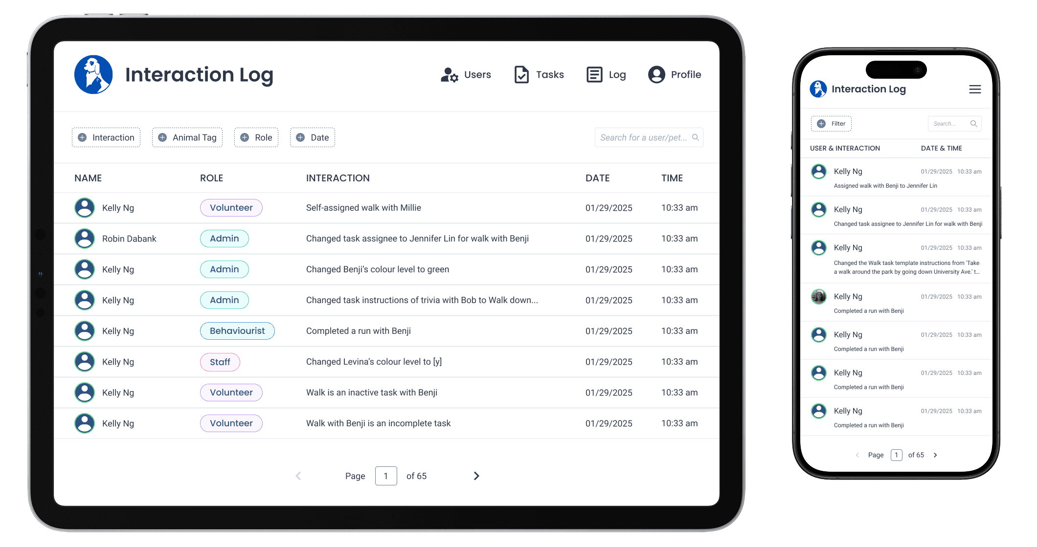
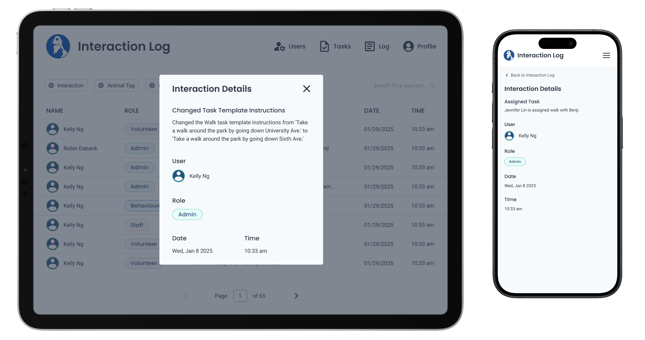
Interaction Log


જ⁀➴₊⊹
Interaction
Mobile Filtering
Mobile Design
Transforming Tablet Designs to Mobile
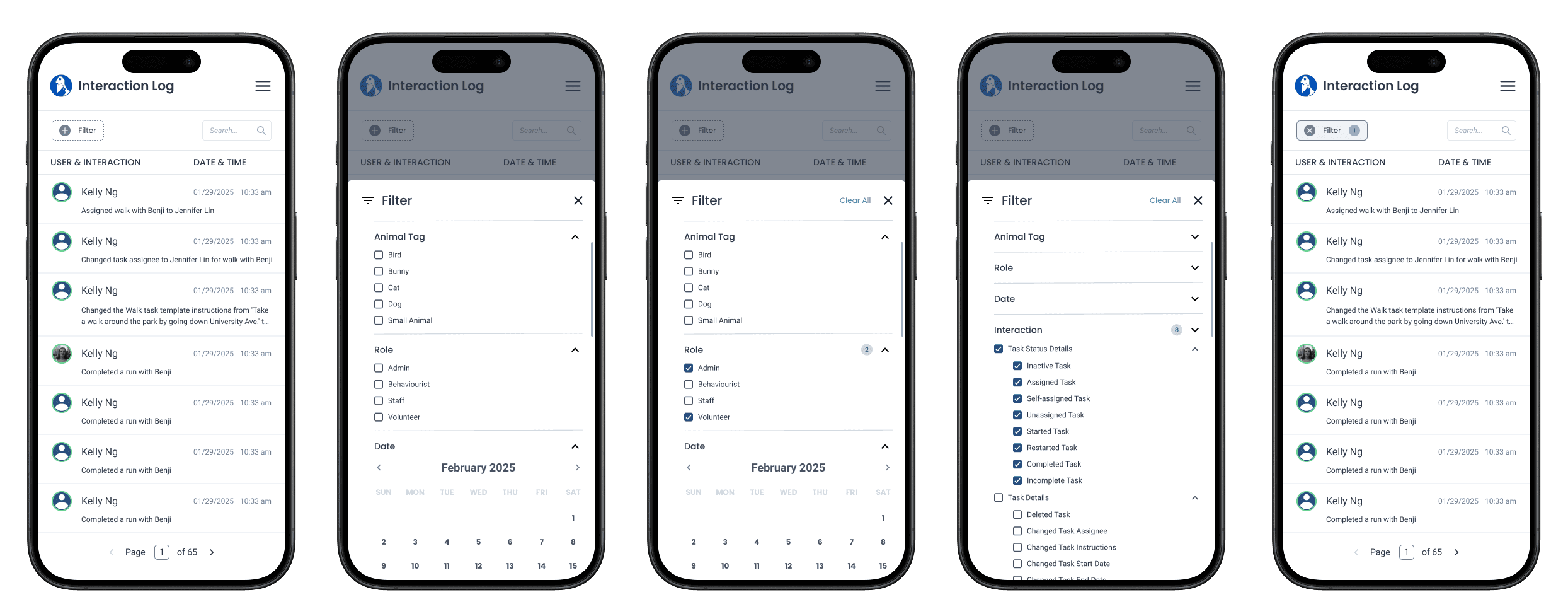
When adapting our designs from tablet to mobile, I led the redesign of our filtering component, which was originally too large to fit effectively on smaller screens.

Final Design
Mobile Filter
With the quantity of filters, I designed a scrollable filter that opened from the bottom.

Iterating
Date Filter
It took me a while to find a design that worked for filtering by date.

×
Extra clicks?
Devs and PMs agreed that this flow involved way too many clicks.
×
Too much dev effort
As well, with timeline as a concern, the introduction of a new pop-up component lacked consistency and required more dev effort to build.
Final Date Filter Design

Informed by feedback from PMs and developers, I iterated on a design that reduced unnecessary clicks and incorporated a built-in calendar, similar to the design from tablet.
✓
Aligned with tablet designs + less clicks
જ⁀➴₊⊹
Final Solution
Final Designs
The Solution
All-in-one Management Tool
We designed an all-in-one web-app solution for both tablet and mobile devices on browsers. Here are some parts of the tool I worked on.
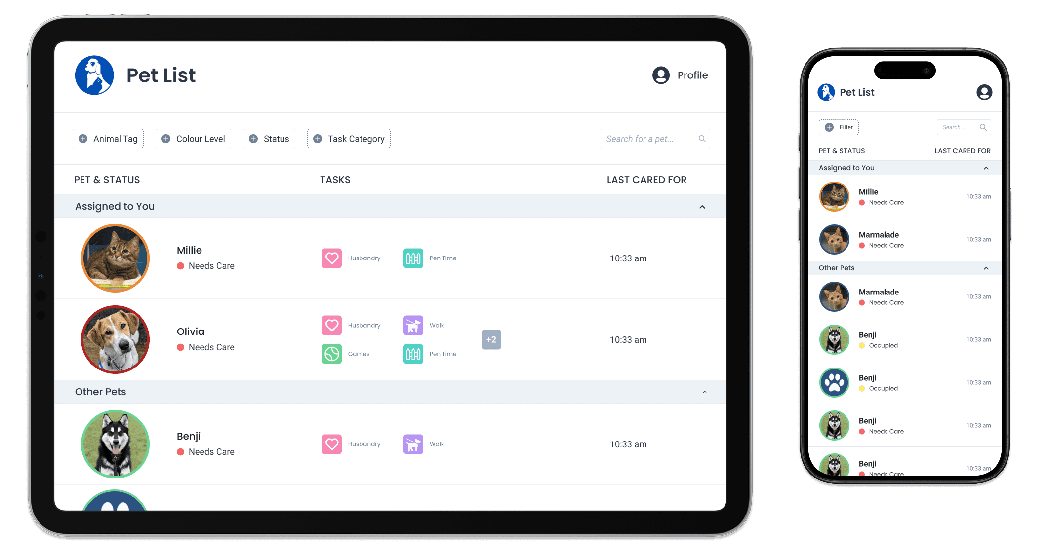
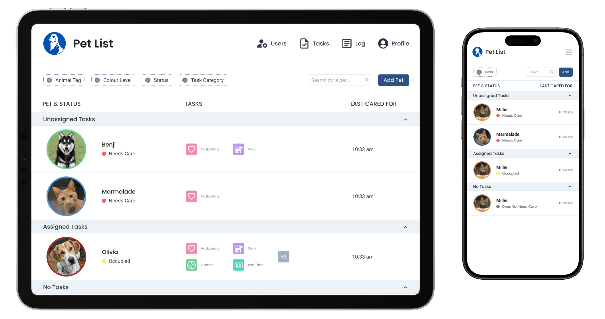
✮ Pet List
The home page! Pets are displayed based on urgency of needing care. Sections are different based on user type (volunteer or admin). From here, users can filter, view pet profiles and take on tasks.
↑ Pet List for volunteers.
↑ Pet List for admins.
✮ Interaction Log
Admin only page where they can view all interactions occurring in the system.
✮ Mobile Filtering
I designed the mobile filtering!
જ⁀➴₊⊹
The End.
Reflecting
Key Takeaways
What did I learn?
Handoff & Collaboration
This was one of my first real handoffs, so I put in a ton of effort to make everything super clear for our devs. I held walkthrough sessions to explain the designs and recorded videos since development at Blueprint often continues without a designer on hand. I learned so much about what makes a smooth handoff, lessons I carry with me into every project now!
Scoping & Alignment
In the middle of the project timeline, we struggled a lot with misalignment as we lost consistent contact with the client. Working though this experience really reinforced the importance of thorough scoping!
My Gratitude
My time as a product designer on OMHS x UW Blueprint was so influential for fuelling my passion for product design and building community. Big thanks to every PM, developer and designer who I met along this journey!
₍ᐢ. .ᐢ₎ ₊˚⊹♡